
 2025-2026

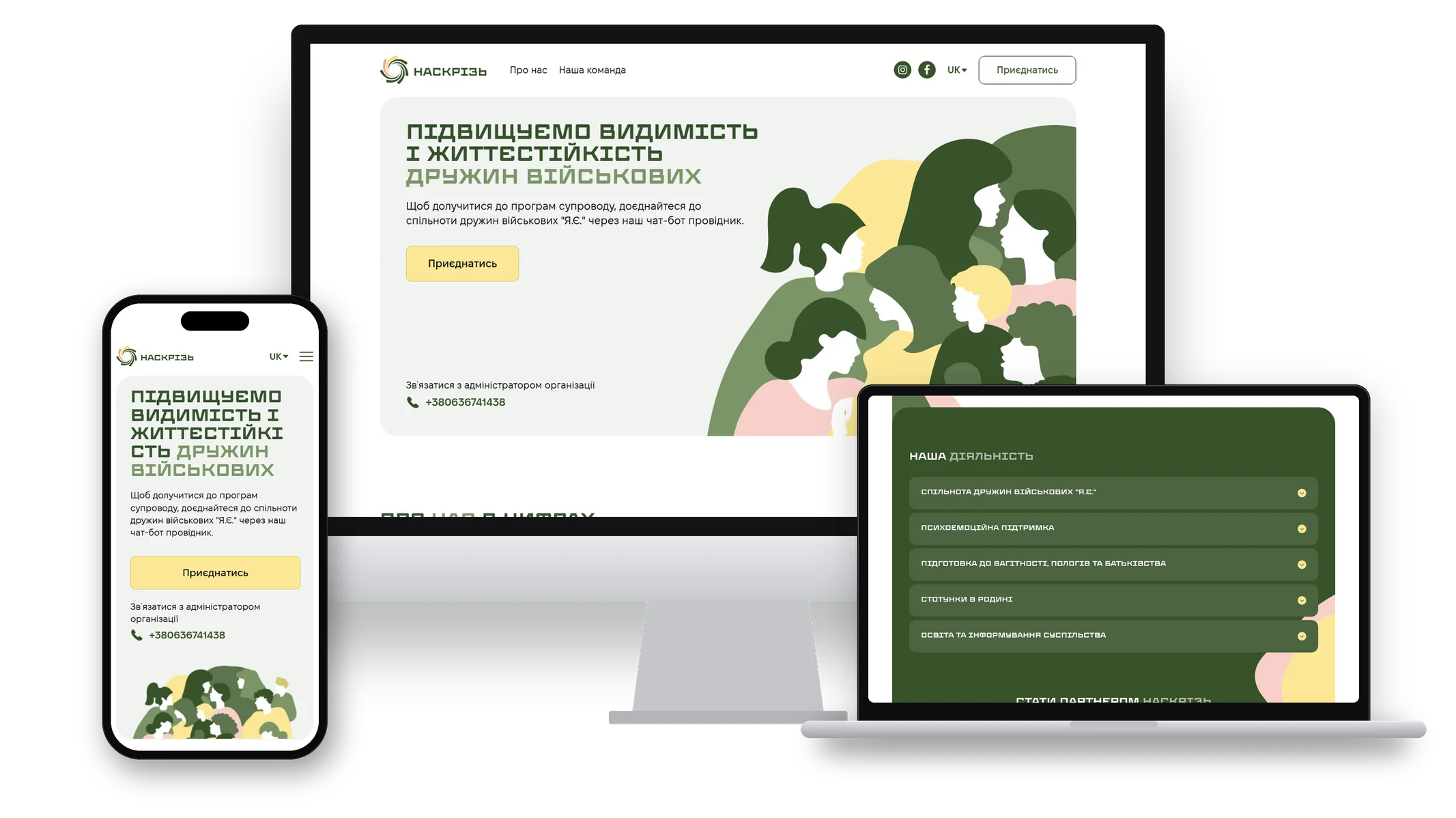
NASKRIZ is an NGO that grew out of the Ya.Ye. (I.Am.) project of the Rii charitable foundation. Since 2023, the team has been bringing military wives together in a private community, running Warm Circles psycho-emotional support groups, childbirth preparation courses, individual consultations with specialists, and programs on family relationships. In 2025, the project became a separate organization and needed a website of its own.
The website had to do several things at once: briefly explain what the organization does, guide a military wife to the community through a chatbot with verification, show the results of the work to partners and donors, and introduce a team of more than fifty specialists. It was important to keep the brand's warm yet restrained visual language and to make the site convenient on smartphones, since the key action on the site is moving to Telegram.
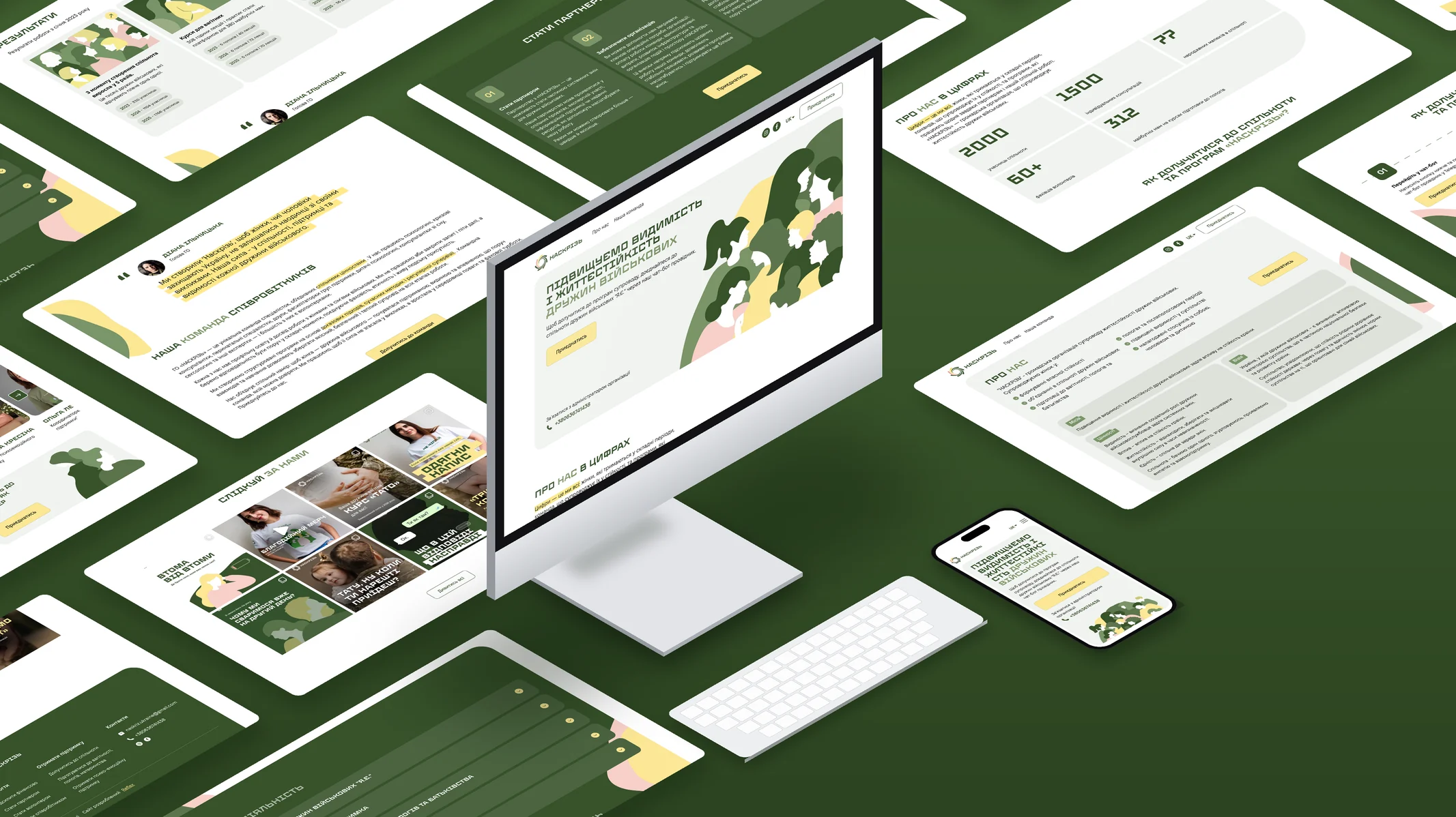
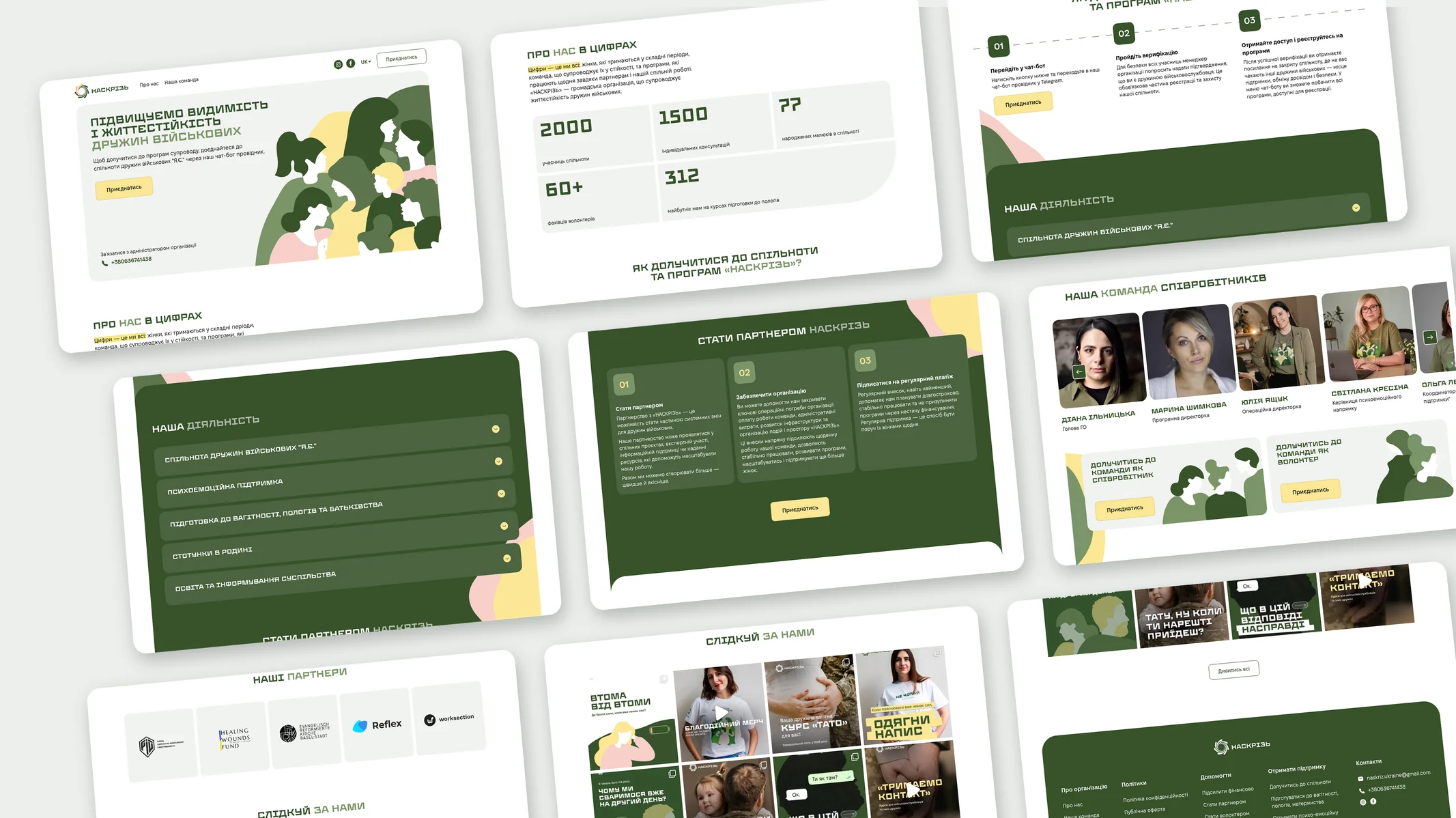
For NASKRIZ, we developed a unique website design based on the organization's brand identity. From the identity we took the logo, the typefaces — the wide Enerhodar for headings and numbers and Fixel for body text — and a five-color palette: deep green, olive, sage, yellow, and pink. On this basis, we assembled a UI kit with a system of headings and text styles and built custom interface elements: cards with large corner radii, yellow buttons, key phrases highlighted with a marker effect, and soft decorative shapes in the background. Vector illustrations of women run through the entire site and set a warm yet restrained tone without stock photos.
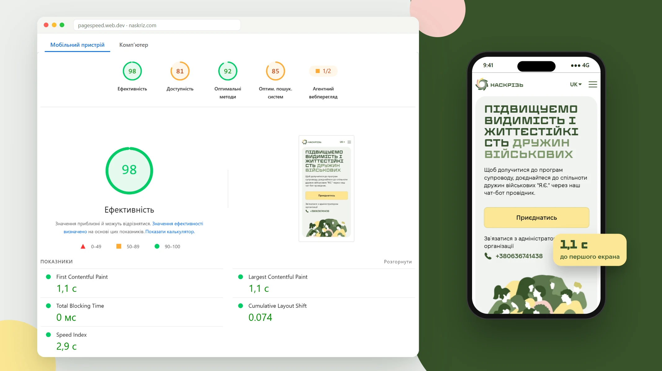
The key action on the site is moving to Telegram from a smartphone, so the speed of the mobile version was one of our priorities. In the Google PageSpeed Insights test of 12.11.2026, the mobile version scored 98 for performance and 92 for best practices, and the desktop version scored 95 for performance. The first screen appears in 1.1 s even on an emulated slow 4G connection, the page does not block interaction (Total Blocking Time is 0 ms), and it barely shifts while loading (CLS 0.074). We achieved this thanks to a lightweight custom WordPress theme without heavy page builders and images in WebP format.
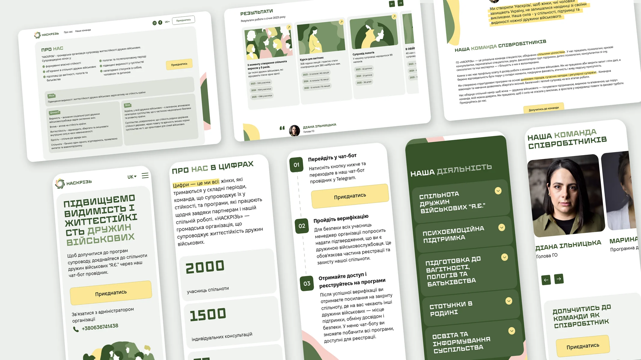
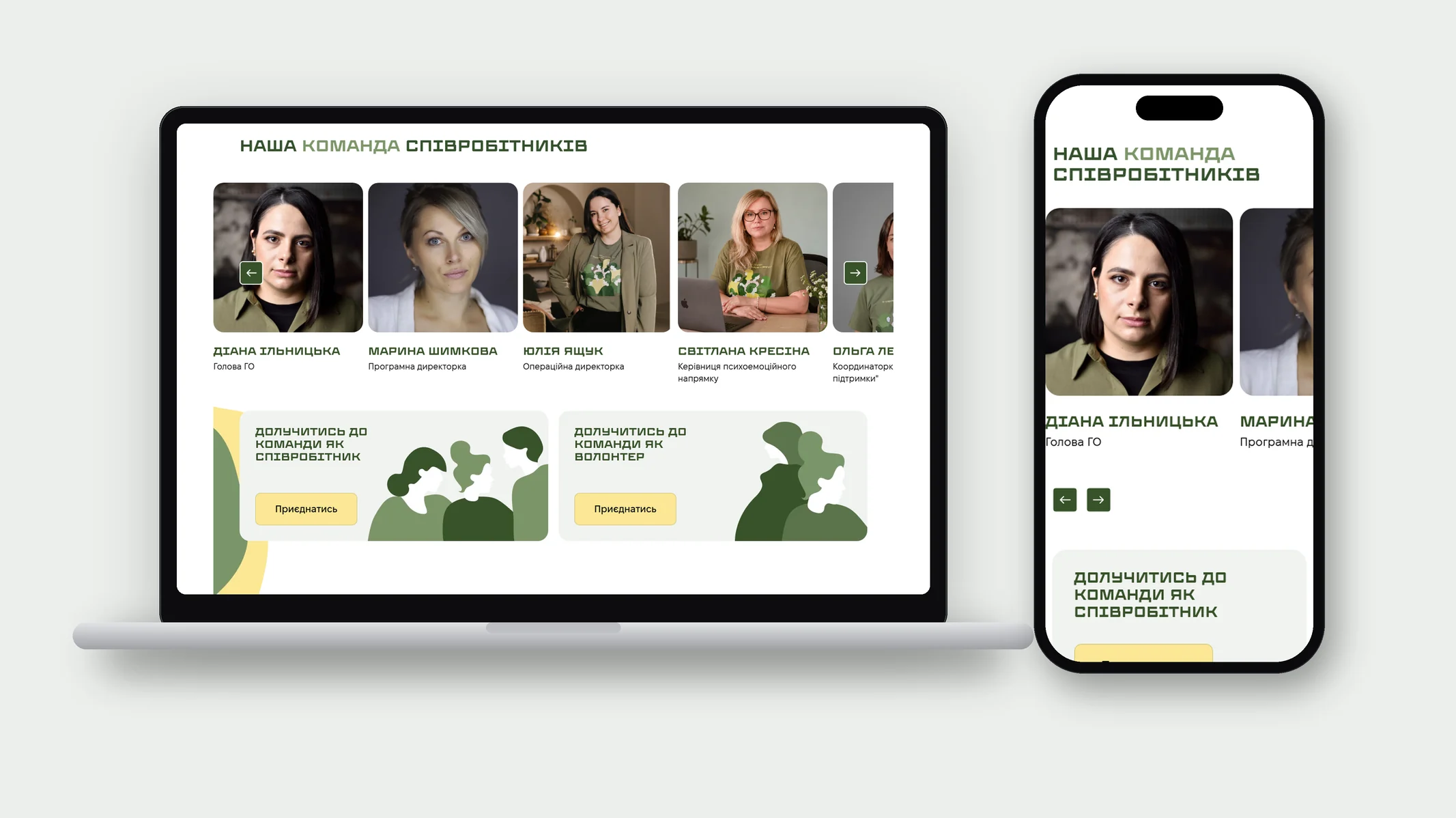
The key action on the site is moving to Telegram, so we paid special attention to the mobile version. On smartphones, the blocks rearrange into a single column: the joining steps become a vertical timeline, the number and area cards stretch to full width, and the team and results are swiped through. A separate mobile version of the illustration was prepared for the first screen, and the Join button spans the full width of the screen. The About us page with the mission, year-by-year results, and the quote from the head of the organization reads just as comfortably on a phone.
The homepage tells the organization's story step by step, block by block. The first screen states the mission and leads to the Join button, which opens the guide chatbot in Telegram. Next come the community's key numbers, three steps to join (chatbot, verification, access to programs), and an accordion with the areas of work. Below are a block for partners and donors, a team slider, an invitation to join as a staff member or volunteer, partner logos, and an Instagram feed. Each block answers a separate visitor question, so the page is easy both to read in full and to scroll quickly to the section you need.
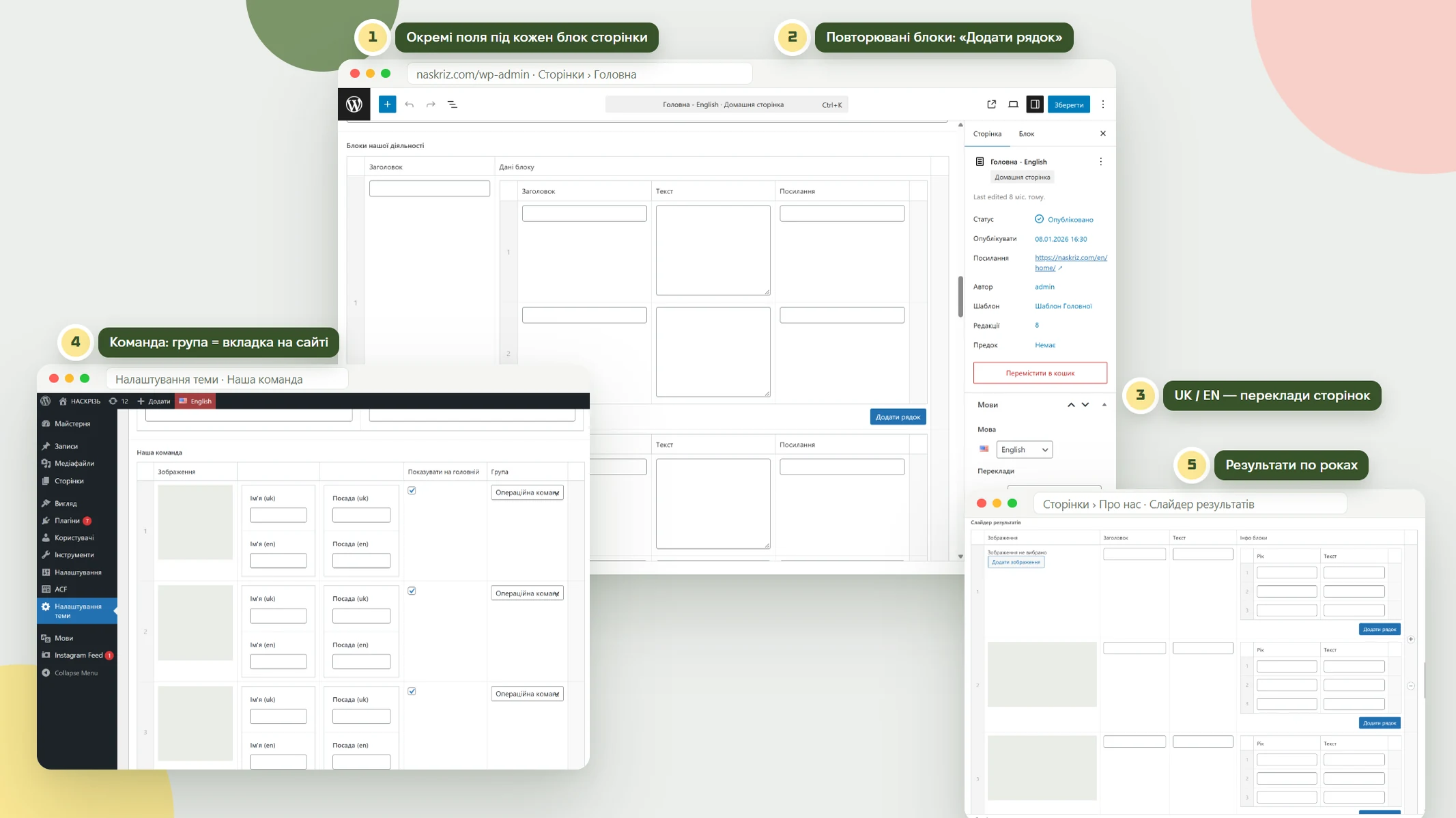
For NASKRIZ, we set up the admin panel to match the structure of the website. Each page block has its own set of fields: heading, text, numbers, and links, so changes are made in a form while the design and layout stay untouched. Areas of work, programs, joining steps, and year-by-year results are built as repeatable blocks: they can be added, removed, and dragged to change their order on the site. The team is managed in a separate theme settings section: each staff member's card includes a photo, name and role in two languages, a group that becomes a filter tab on the Our team page, and a checkbox for showing her on the homepage. Contacts, social media, and the Telegram bot link are set once and appear everywhere on the site, the Ukrainian and English pages are linked as translations, and the Instagram feed updates automatically.
The organization has more than fifty specialists: psychologists, support group facilitators, doulas, and breastfeeding and sleep consultants. To keep the long list clear, the team is divided into four groups — operations team, community moderation, psycho-emotional support, and support for pregnant women and mothers — with a switcher that shows only the selected group. Each card contains a photo, name, and role. On the homepage and the About us page, the team is presented in a slider with key staff members, alongside two banners for those who want to join as a staff member or volunteer.
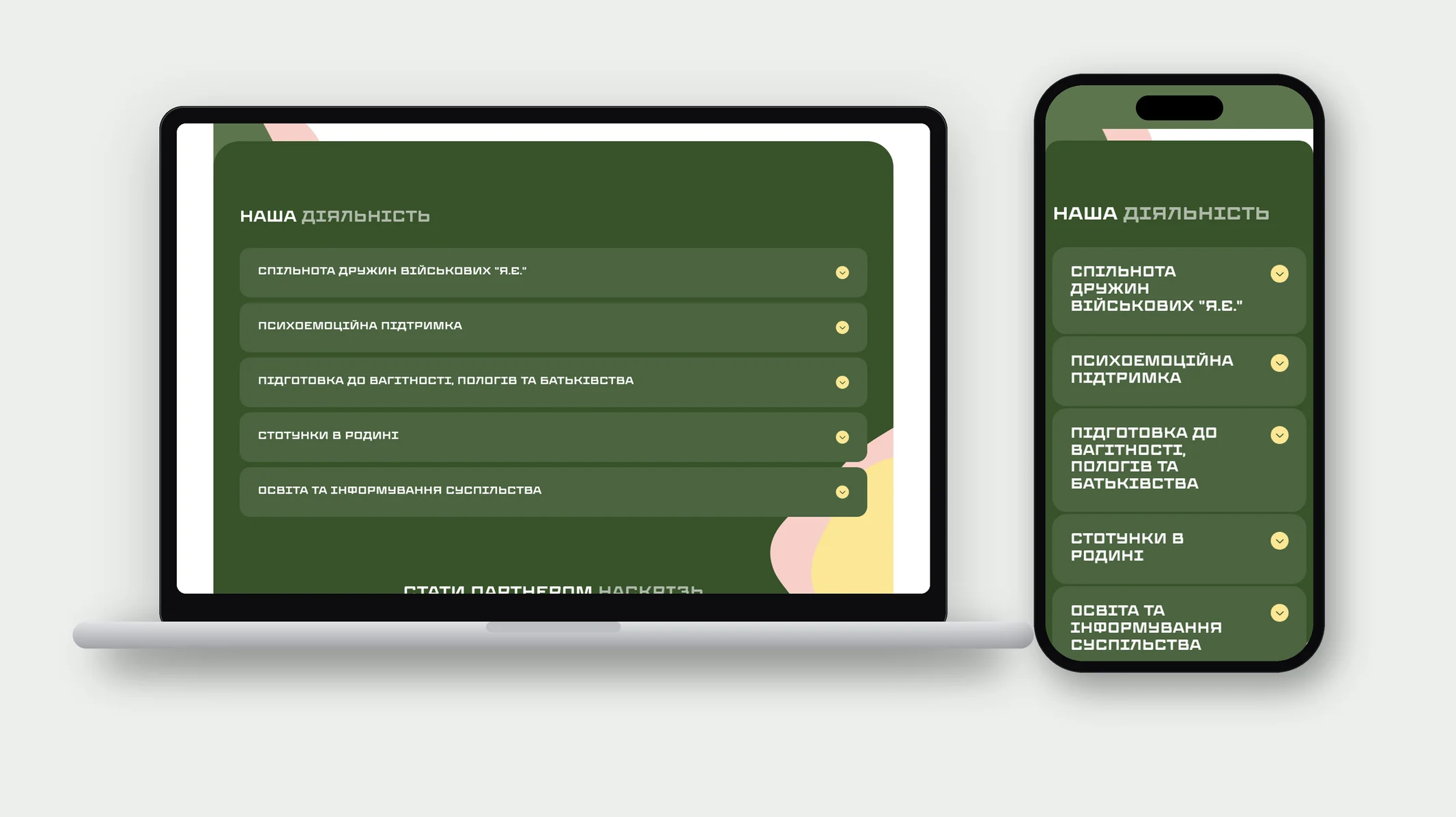
Five areas of work — the Ya.Ye. community, psycho-emotional support, preparation for pregnancy and childbirth, family relationships, and public education — are gathered in an accordion on a dark green background. Inside each area, program cards open up with short descriptions and Learn more links. This way, fifteen programs fit on one screen without overloading the page, and a visitor sees only what interests her. When a new program appears, it is added as another card without changing the page structure.
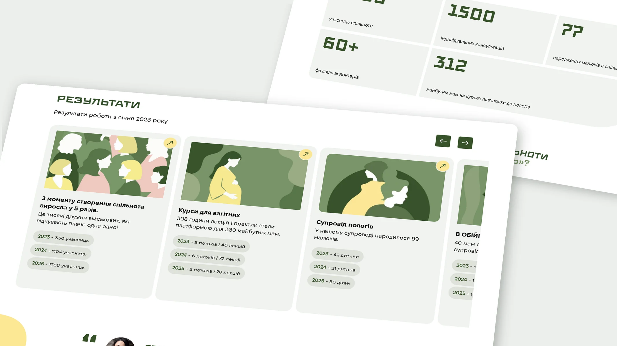
The numbers block on the homepage shows the scale of the work with five large figures: community members, consultations, babies born, volunteer professionals, and expectant mothers on courses. On the About us page, this data is expanded into a results slider: each card has an illustration, a short summary, and chips with a breakdown by year since 2023. This format suits partners and donors who want to see the dynamics rather than just the totals. Next to it are the mission, values, and vision cards and a quote from the head of the organization, which add a human voice to the numbers.
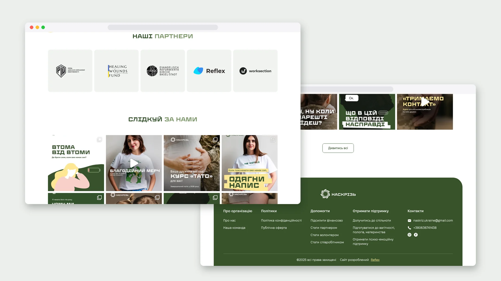
The website has Ukrainian and English versions with a switcher in the header, which makes it possible to present the organization's work to international partners and donors. The latest Instagram posts are pulled onto the homepage automatically, so the page stays up to date without manual updates. Separate blocks invite visitors to become a partner, support the organization financially, or set up a recurring donation, and partner logos are collected in a separate row.
As a result, NASKRIZ received a website that works both as the organization's business card and as an entry point to the community. A visitor understands within seconds where she is and what to do next; a partner sees the areas of work and year-by-year results; a candidate for the team sees open roles and an application form. The Reflex logo is displayed on the site among the organization's partners.
Our experts will select the most effective solution